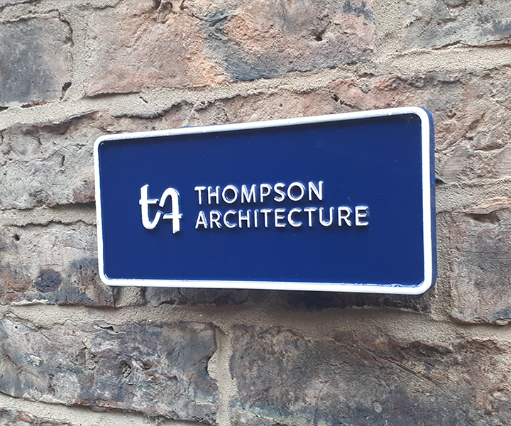
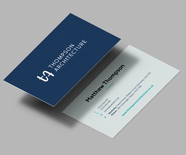
Matthew contacted me, wanting a name and brand for his new partnership with his father.
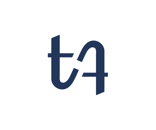
The brand needed to encompass the experience and reputation his father had built up, while establishing itself as something different. After lots of discussion, it made sense to keep the Thompson name front and centre. At the heart of the brand is the simple ident that combines a traditional-feeling serif ‘t’ that flows into a more modern ‘A’ – reflecting the practice’s varied output of both modern and historical sympathetic design work. It’s also amibigramic, signifying how the practice considers every angle within each project.